
WordPress Admin Guideline Manual
Block Option : Accordion
| Field | Field Type | Required? | Helper Text | Notes |
|---|---|---|---|---|
| Accordion | accordion | Not Required |
Theme Settings
| Field | Field Type | Required? | Helper Text | Notes |
|---|---|---|---|---|
Header |
||||
| Logo | image | Not Required | The primary logo displayed in the site header. | |
| Utility Links | repeater | Not Required | Small utility links or icons in the header. | |
| — Link | link | Not Required | The link for the utility item. | |
| Contact Sales Button | link | Not Required | Primary call-to-action button in the header. | |
Footer |
||||
| Background Color | button_group | Not Required | The background color for the footer section. |
|
| Social Icons | repeater | Not Required | Add and manage social media profile links. | |
| — Social Icon | font-awesome | Required | Select the social media icon | |
| — Link | url | Not Required | URL to the social media profile. | |
| Footer Logo | image | Not Required | Logo displayed in the footer section. | |
| Address | link | Not Required | Company address and location link. | |
| Contact Sales Button | link | Not Required | Contact sales button in the footer. | |
| Copyright Text | text | Not Required | Standard copyright notice at the bottom of the page. | |
Global |
||||
| Cookies Consent Script | textarea | Not Required | Insert the third-party cookie consent script here. | |
| Google script in head | textarea | Not Required | Insert the Google script to be loaded in the section. | |
| Google script in body | textarea | Not Required | Insert the Google script to be loaded immediately after the opening tag. | |
Defensics |
||||
| Region | text | Not Required | S3 Region (e.g. eu-west-1) | |
| Bucket | text | Not Required | S3 Bucket (e.g. datasheets.defensics.com) | |
| Contact Us Link | link | Not Required | Link for the Defensics Contact Us page/form. | |
| View all Defensics Link | link | Not Required | Link to view all Defensics protocols. | |
Marketo |
||||
| Forms endpoint | text | Not Required | ||
| Server instance | text | Not Required | ||
| Identity endpoint | text | Not Required | ||
| Munchkin account ID | text | Not Required | ||
Brand Colors |
||||
| Color Palette | repeater | Not Required | Add custom colors to the WYSIWYG editor toolbar. | |
| — Color Name | text | Required | e.g. Primary | |
| — Color Value | color_picker | Required | Select a color | |
Page Settings
| Field | Field Type | Required? | Helper Text | Notes |
|---|---|---|---|---|
| Enable Breadcrumb | true_false | Not Required | Enable to display breadcrumb navigation on this page/post. | |
| Page Title | text | Not Required | ||
| Enable Landing Header Layout | true_false | Not Required | Enable to display a simplified header (hides topbar, search, and mega-menu dropdowns). | |
| Landing Header Menu Selection | select | Not Required | Select the custom menu to display in the header for this page. |
|
| Landing Header CTA Link | link | Not Required | Override the default global header CTA button for this page. |
404 Page Fields
| Field | Field Type | Required? | Helper Text | Notes |
|---|---|---|---|---|
404 Content |
||||
| Image | image | Required | Hero image to display on the 404 page. | |
| Description | wysiwyg | Required | The message shown to users when a page is not found. | |
| Action Buttons | repeater | Not Required | Buttons to help users navigate back to safety. | |
| — Button Link | link | Not Required | The destination URL for the button. | |
| — Button Style | select | Not Required | The visual style of the button. |
|
Bottom Banner |
||||
| Banner Heading | text | Required | The title for the bottom banner. | |
| Banner Description | textarea | Not Required | Supporting description for the bottom banner. | |
| Banner Action Buttons | repeater | Not Required | Buttons for the bottom banner call-to-action. | |
| — Button Link | link | Not Required | The destination URL for the banner button. | |
| — Button Style | select | Not Required | The visual style of the banner button. |
|
Block: Accordion Media
View Preview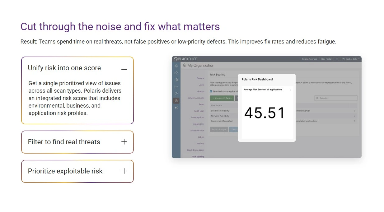
| Field | Field Type | Required? | Helper Text | Notes |
|---|---|---|---|---|
Block Header |
||||
| Block Title | text | Not Required | Main title displayed above the accordion. | |
| Block Heading Type | select | Not Required | Select the HTML heading tag for accessibility. |
|
| Block Heading Size | select | Not Required | Select the HTML heading tag for accessibility. |
|
| Block Heading Color | select | Not Required | Choose the text color for the block title. |
|
| Block Description | wysiwyg | Not Required | Optional description text displayed under the block title. | |
Accordion Detail |
||||
| Accordion Variant | button_group | Not Required | Select the display variant for the accordion. |
|
| Enable Image Shadow | true_false | Not Required | Enable shadow effect on accordion images. | |
| Accordion Items | repeater | Required | Add and manage individual accordion items. | |
| — Title | text | Required | The clickable title for the accordion item. | |
| — Description | wysiwyg | Required | The content revealed when the accordion item is expanded. | |
| — Select Media Type | button_group | Not Required | Select whether to display a static image or a video. |
|
| — Media | image | Not Required | Add an image for this accordion item. | |
| — Video Provider | button_group | Not Required | Select the hosting platform for the video. |
|
| — Video Language | button_group | Not Required | Select the language for the Brightcove video player. |
|
| — Video Player Mode | button_group | Not Required | Choose if the video plays inline or in a popup modal. |
|
| — Video ID/URL | text | Required | Enter the ID or URL of the video (YouTube/Brightcove). | |
| — Video Placeholder | image | Not Required | Image to display as the trigger for the video modal. | |
Block: Advanced TOC
| Field | Field Type | Required? | Helper Text | Notes |
|---|---|---|---|---|
TOC Content |
||||
| TOC Title | text | Not Required | Title to display above the Table of Contents. | |
| TOC Mode | radio | Not Required |
|
|
| Included Headings | checkbox | Not Required | Select which heading levels to include in the dynamic TOC. |
|
| Select ACF Blocks to Scan | select | Not Required | Select which ACF blocks should be scanned for headings. |
|
| Manual Links | repeater | Not Required | ||
| — TOC Label | text | Required | ||
| — TOC ID | text | Required | The anchor ID without the # (e.g. section-1) | |
Dynamic Cards
View Preview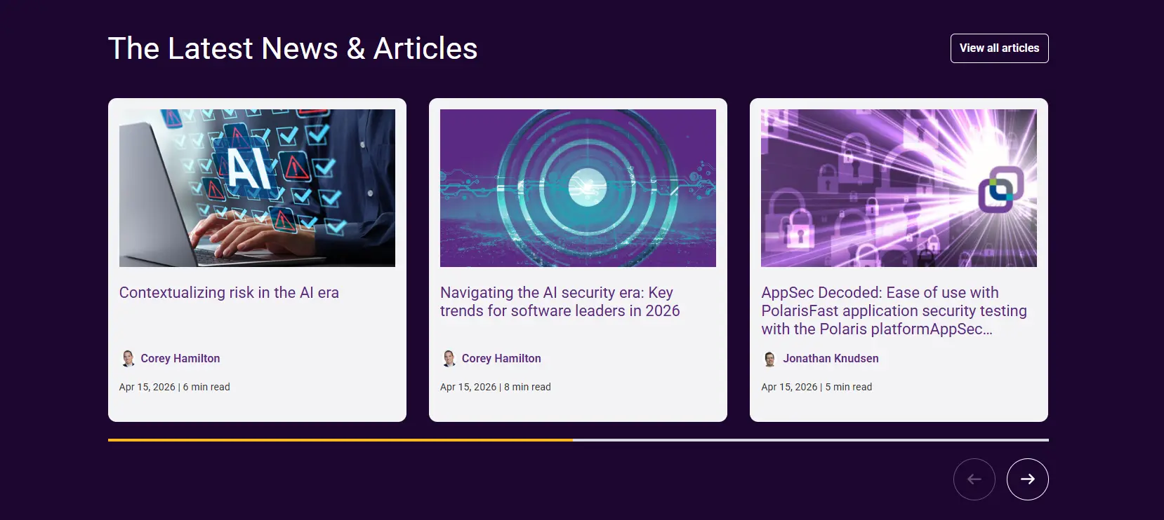
| Field | Field Type | Required? | Helper Text | Notes |
|---|---|---|---|---|
Cards Details |
||||
| Post Pull Type | button_group | Not Required | Choose whether to show the latest posts or select them manually. |
|
| Content Display Limit | number | Required | Total number of posts to show. | |
| Display as Carousel | button_group | Not Required | Enable carousel slider for the cards. |
|
| Select Posts | relationship | Not Required | Select up to 6 posts manually. | |
| Select Category | taxonomy | Not Required | Select a category to filter dynamic posts. Leave empty to show all. | |
| Select Tags | taxonomy | Not Required | Select a category to filter dynamic posts. Leave empty to show all. | |
| Select Products | taxonomy | Not Required | Select a category to filter dynamic posts. Leave empty to show all. | |
| Select Solutions | taxonomy | Not Required | Select a category to filter dynamic posts. Leave empty to show all. | |
Block Heading |
||||
| Block Title | text | Not Required | Main title displayed at the top of the block. | |
| Button Link | link | Not Required | Optional call-to-action link. | |
| Button Type | button_group | Not Required | Visual style for the action link. |
|
Slider Settings |
||||
| Slider Settings | checkbox | Not Required | Select one or more slider behavior options. |
|
Asset Card
View Preview
| Field | Field Type | Required? | Helper Text | Notes |
|---|---|---|---|---|
Block Header |
||||
| Block Title | text | Not Required | Main title displayed at the top of the block. | |
| Block Heading Type | button_group | Not Required | Select the HTML heading tag for accessibility. |
|
| Block Heading Size | button_group | Not Required | Select the HTML heading tag for accessibility. |
|
| Block Heading Color | button_group | Not Required | Choose the text color for the block title. |
|
| Block Description | wysiwyg | Not Required | Optional description text for the block. | |
Assets Cards |
||||
| Card Variation | select | Not Required | Select the visual style for the cards. |
|
| Grid Column ( Desktop ) | radio | Not Required | Number of columns to show in the grid on desktop. |
|
| Card Heading Type | select | Not Required | Select the HTML heading tag for accessibility. |
|
| Card Heading Size | select | Not Required | Select the HTML heading tag for accessibility. |
|
| Show Button | true_false | Not Required | Toggle to show or hide the button on the cards. | |
| Show Featured Image | true_false | Not Required | Toggle to show or hide the featured image on the cards. | |
| Asset Cards | repeater | Not Required | Add and manage individual asset cards. | |
| — Data Source | button_group | Not Required | Choose whether to enter data manually or pull from a page. |
|
| — Select Page/Post | post_object | Not Required | Select a page or post to automatically pull title, excerpt, and image. | |
| — Eyebrow Text (Override) | text | Not Required | Text displayed above the main heading. | |
| — CTA (Override) | link | Not Required | The link and text for the card’s button. Overrides page link if dynamic source is used. | |
| — CTA Text | text | Not Required | Link text for the card’s button. | |
| — Heading (Override) | text | Not Required | The main title of the card. Overrides page title if dynamic source is used. | |
| — Descriptin (Override) | textarea | Not Required | Short summary text for the card. Overrides page excerpt if dynamic source is used. | |
| — Media Type | button_group | Not Required | Select the type of media to display on the card. |
|
| — Image (Override) | image | Not Required | The image to display on the card. Overrides page featured image if dynamic source is used. | |
| — Video Player Mode | button_group | Not Required | Choose if the video plays inline or in a popup modal. |
|
| — Video Provider | button_group | Not Required | Select the video hosting platform. |
|
| — Video Language | button_group | Not Required | Select the specific Brightcove player ID based on language. |
|
| — Video ID/URL | text | Not Required | Enter the Video ID (for Brightcove/YouTube) or full URL. | |
| — Video Placeholder | image | Not Required | Thumbnail image displayed before the video plays. | |
| — Custom SVG Icon | file | Not Required | Upload a custom SVG icon file. | |
| — Font Awesome Icon | font-awesome | Not Required | Select an icon from the Font Awesome library. | |
| — Tracking Script | textarea | Not Required | Add any tracking scripts here. | |
Block: Coveo Search
View Preview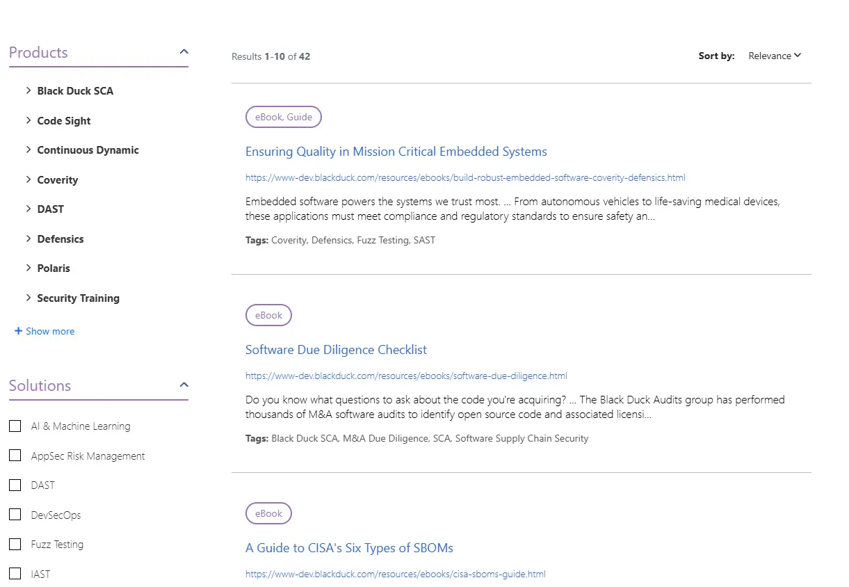
| Field | Field Type | Required? | Helper Text | Notes |
|---|---|---|---|---|
Content |
||||
| Search Experience | select | Required | Select the Coveo search hub for this layout. |
|
| HTML Markup | textarea | Not Required | Enter custom HTML markup for the search component if needed. | |
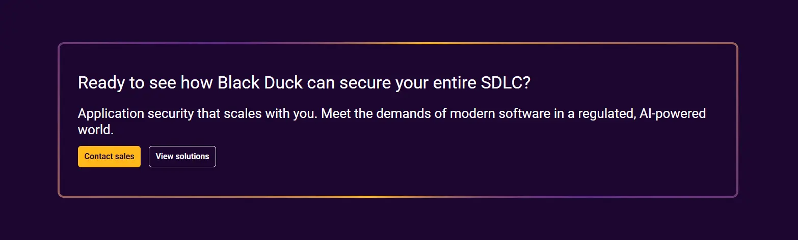
Blog Settings
| Field | Field Type | Required? | Helper Text | Notes |
|---|---|---|---|---|
| Show Social Share | true_false | Not Required | Toggle social share buttons on the blog detail page. | |
| Show Marketo Form | true_false | Not Required | Toggle the sidebar Marketo form on post detail pages. | |
| Show Latest Post | true_false | Not Required | Toggle the latest post section on post detail pages. | |
| Show Explore Topics | true_false | Not Required | Toggle the explore topics section on post detail pages. | |
| Community Engagement Title | text | Not Required | ||
| Community Engagement Link | link | Not Required |
Block: Carousel
View Preview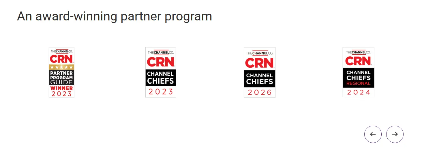
| Field | Field Type | Required? | Helper Text | Notes |
|---|---|---|---|---|
Settings |
||||
| Card Selection | button_group | Not Required | Select the number of cards to display per view on desktop. |
|
| Slider Settings | checkbox | Not Required | Configure how the slider operates. |
|
Content |
||||
| Block Heading | text | Not Required | Main title displayed above the carousel. | |
| Heading Type | button_group | Not Required | Select the HTML heading tag for accessibility. |
|
| Heading Color | select | Not Required | Choose the text color for the block heading. |
|
Slides |
||||
| Carousel Repeater | repeater | Not Required | Add and manage carousel items. | |
| — Image | image | Required | Upload or select an image for this slide. | |
| — Content | wysiwyg | Not Required | The content displayed alongside the image. | |
Case Study Challenge
View Preview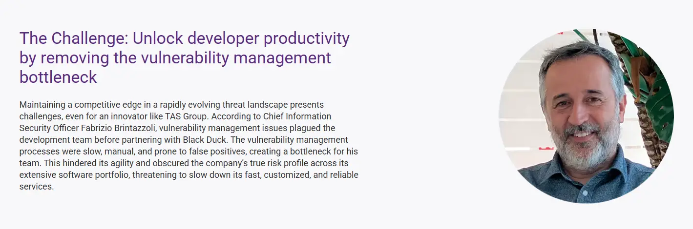
| Field | Field Type | Required? | Helper Text | Notes |
|---|---|---|---|---|
Content |
||||
| Block Heading | text | Not Required | Main headline for the block. | |
| Block Heading Type | button_group | Not Required | Select the HTML heading tag for accessibility. |
|
| Block Heading Size | button_group | Not Required | Select the HTML heading tag for accessibility. |
|
| Block Heading color | button_group | Not Required | Choose the text color for the block heading. |
|
| Block Description | wysiwyg | Not Required | Supporting text for the challenge description. | |
| Image | image | Not Required | Upload or select an image for this section. | |
| Block Bottom Description | wysiwyg | Not Required | Supporting text for the challenge bottom listing/description. | |
Block: Comparison Table
View Preview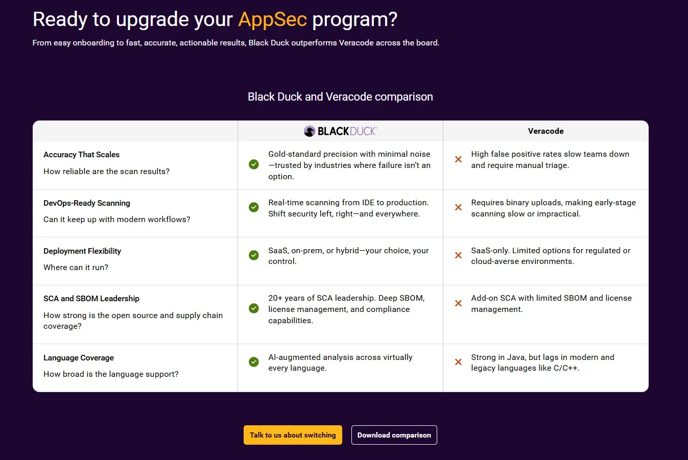
| Field | Field Type | Required? | Helper Text | Notes |
|---|---|---|---|---|
Block Header |
||||
| Block Title | text | Not Required | Main title displayed above the comparison table. | |
| Heading Type | select | Not Required |
|
|
| Heading Size | select | Not Required |
|
|
| Heading Color | button_group | Not Required |
|
|
| Block Subtitle | textarea | Not Required | Optional subtitle text. | |
| Table Title | text | Not Required | Title appearing directly above the table. | |
| Column 1 Logo | image | Not Required | ||
| Column 2 Title | text | Not Required | ||
| Comparison Rows | repeater | Not Required | ||
| — Row Title | text | Not Required | ||
| — Row Description | text | Not Required | ||
| — Column 1 Text | textarea | Not Required | ||
| — Column 1 Icon | select | Not Required |
|
|
| — Column 2 Text | textarea | Not Required | ||
| — Column 2 Icon | select | Not Required |
|
|
| Primary Link | link | Not Required | ||
| Secondary Link | link | Not Required | ||
Compliance Overview
View Preview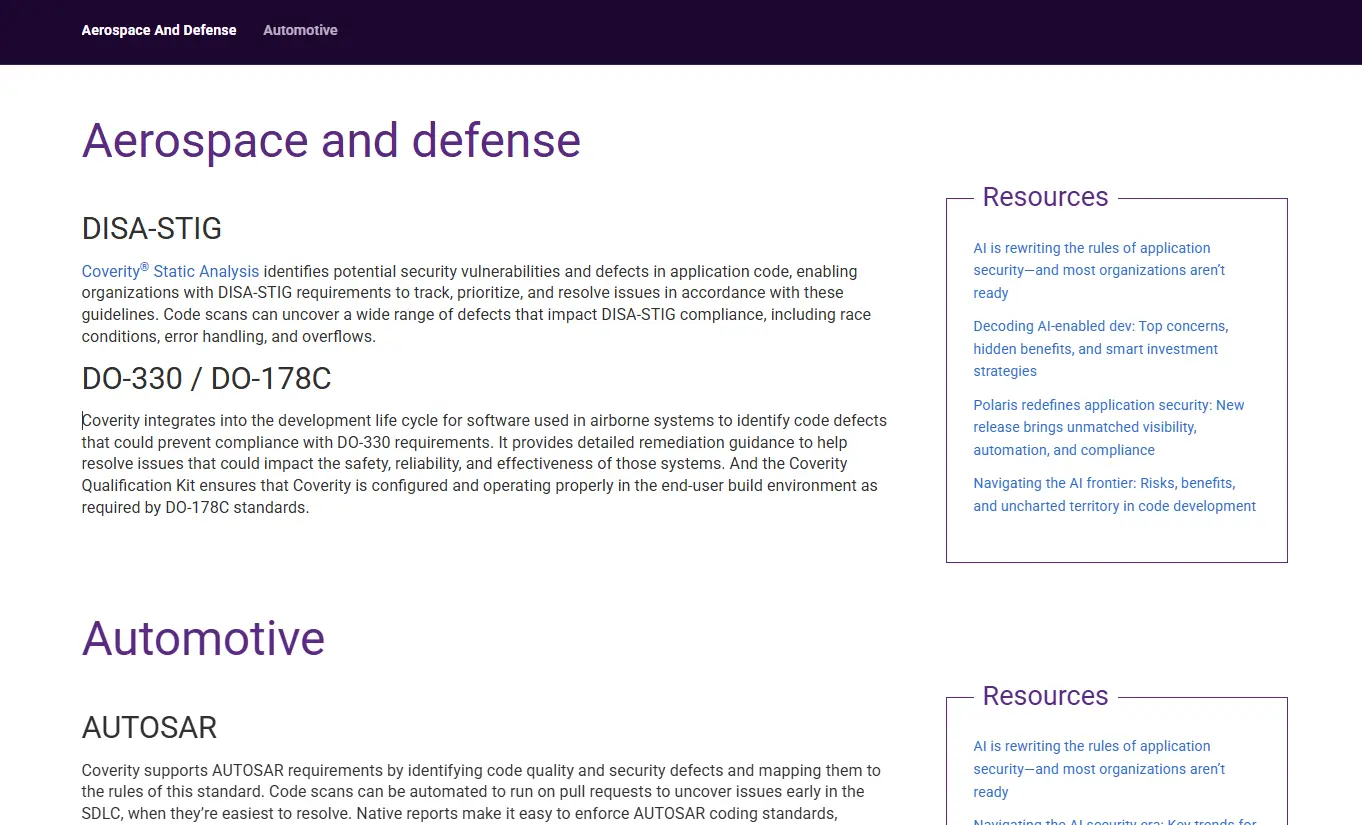
| Field | Field Type | Required? | Helper Text | Notes |
|---|---|---|---|---|
Compliance Items |
||||
| Compliance Items | repeater | Not Required | Add and manage compliance items. | |
| — Floating Tab ID | text | Not Required | ID for anchor navigation (e.g. aerospace). | |
| — Compliance Heading | text | Required | The main title for this compliance section. | |
| — Compliance Description | wysiwyg | Not Required | Detailed explanation or content for this compliance section. | |
| — Resource Links | repeater | Not Required | Add and manage resource links on the right. | |
| — — Link | link | Not Required | ||
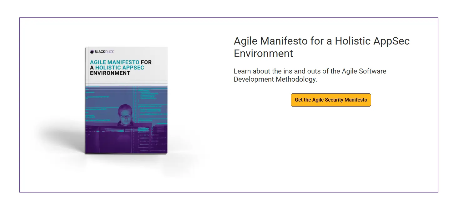
Custom HTML/CSS/JS
| Field | Field Type | Required? | Helper Text | Notes |
|---|---|---|---|---|
| Block Layout | button_group | Not Required |
|
|
Block Heading |
||||
| Block Title | text | Not Required | Main title displayed at the top of the block. | |
| Block Heading Type | select | Not Required | Select the HTML heading tag for accessibility. |
|
| Block Heading Size | select | Not Required | Select the HTML heading tag for accessibility. |
|
| Block Heading Color | select | Not Required | Choose the text color for the block title. |
|
Code |
||||
| Block Description | wysiwyg | Not Required | Enter custom HTML here. | |
| HTML | textarea | Not Required | Enter custom HTML here. | |
| CSS | textarea | Not Required | Enter custom CSS here (without tags). | |
| JavaScript | textarea | Not Required | Enter custom JavaScript here (without tags). | |
Data Table Sheet
View Preview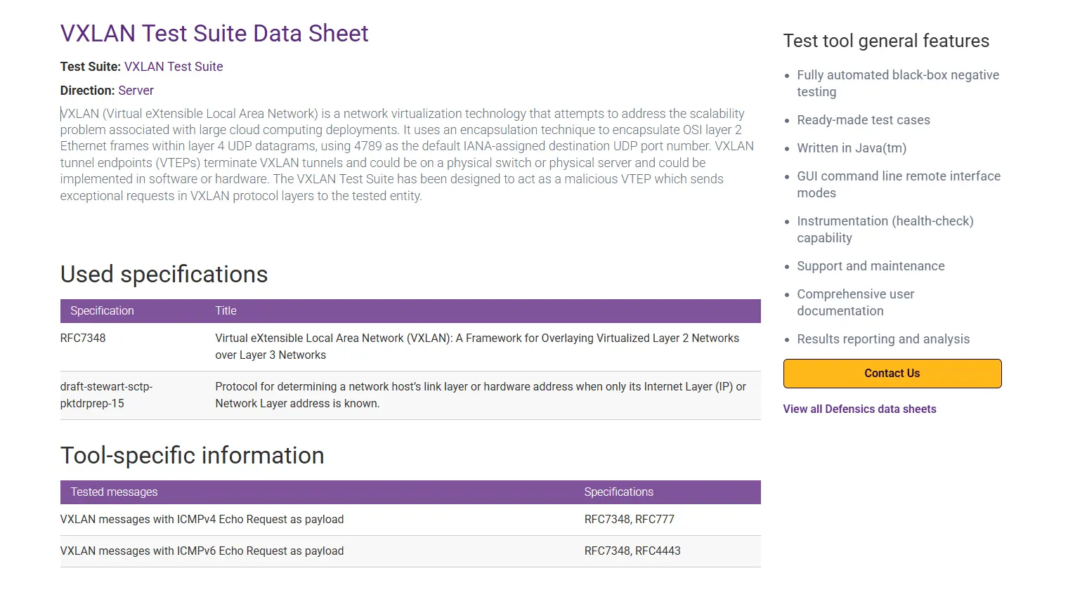
| Field | Field Type | Required? | Helper Text | Notes |
|---|---|---|---|---|
Data Sheet Intro |
||||
| Test Suite Name | text | Not Required | The name or title of the test suite. | |
| Direction | text | Not Required | Optional direction or category information. | |
| Description | wysiwyg | Not Required | Supporting description text for the intro. | |
Data Sheet Detail |
||||
| Tables List | repeater | Not Required | Add and manage one or more data tables. | |
| — Subheading | text | Not Required | Heading displayed above this specific table. | |
| — Column Titles List | repeater | Not Required | Define the headings for each column. | |
| — — Column Title | text | Not Required | The title for this column. | |
| — Rows List | repeater | Not Required | Add individual rows of data to the table. | |
| — — Column Data | repeater | Not Required | Add data for each column in order. | |
| — — — Value | textarea | Not Required | The text content for this specific cell. | |
Test tool general features |
||||
| General Features Title | text | Not Required | Title for the general features list section. | |
| General Features List | repeater | Not Required | Add and manage individual feature points. | |
| — Feature | text | Not Required | Description of the feature. | |
| Contact Us Button | link | Not Required | Link for the primary contact button. | |
| View All Link | link | Not Required | Link to view more related items. | |

Blocks :Explore Topics
View Preview
| Field | Field Type | Required? | Helper Text | Notes |
|---|---|---|---|---|
Select Category |
||||
| Title | text | Not Required | Enter a title for the Explore Topics section. Defaults to ‘Explore Topics’. | |
| Selected Topics | taxonomy | Not Required | Select specific topics to display. If left empty, all active categories will be displayed automatically. | |
Factoid
View Preview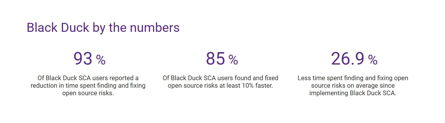
| Field | Field Type | Required? | Helper Text | Notes |
|---|---|---|---|---|
Block Header |
||||
| Layout Variant | button_group | Not Required | Select how the factoids are displayed relative to the header. |
|
| Block Title | text | Not Required | Optional title for the block. | |
| Block Heading Type | select | Not Required | Select the HTML heading tag for accessibility. |
|
| Block Heading Size | select | Not Required | Select the HTML heading tag for accessibility. |
|
| Block Heading Color | select | Not Required | Choose the text color for the block title. |
|
| Block Description | textarea | Not Required | Optional description or subheader for the block. | |
Factoid Content |
||||
| Factoid Items | repeater | Not Required | Add and manage individual factoid entries. | |
| — Factoid eyebrow | text | Not Required | Small text displayed above the main title. | |
| — Factoid Icon | font-awesome | Not Required | Optional icon to display above the number. | |
| — Factoid Number | text | Required | e.g. 93%, 85, 26.9 | |
| — Statistic Color | select | Not Required | Choose the text color for the statistic |
|
| — Factoid Label | textarea | Required | ||
| Factoid CTA | link | Not Required | Optional Call to Action link. | |
| Factoid CTA Style | button_group | Not Required | Select the visual style for the CTA button. |
|
Floating Tabs
View Preview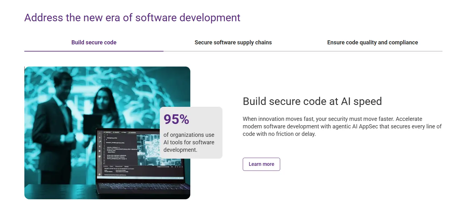
| Field | Field Type | Required? | Helper Text | Notes |
|---|---|---|---|---|
Block Header |
||||
| Block Title | text | Not Required | Main title displayed at the top of the block. | |
| Block Heading Type | button_group | Not Required | Select the HTML heading tag for accessibility. |
|
| Block Heading Size | button_group | Not Required | Select the HTML heading tag size for accessibility. |
|
| Block Heading Color | button_group | Not Required | Choose the text color for the block title. |
|
Floating Tabs |
||||
| Button Style | select | Not Required | Choose the visual style for the action buttons. |
|
| Layout | select | Not Required | Select the layout arrangement for the tabs. |
|
| Animation Type | select | Not Required | Select the entrance animation for the content. |
|
| Enable Image Shadow | true_false | Not Required | Enable shadow effect on tab images. | |
| Tabs | repeater | Required | Add and manage individual floating tabs. | |
| — Tab Title | text | Required | The title displayed on the tab itself. | |
| — Content Title | text | Required | The main title in the content area. | |
| — Layout | select | Not Required | Select the layout arrangement for this specific tab. |
|
| — Content Title Type | button_group | Not Required | Select the HTML heading tag for accessibility. |
|
| — Content Title Size | button_group | Not Required | Select the visual size of the heading. |
|
| — Content Description | wysiwyg | Required | Detailed content for the active tab. | |
| — Action Button | link | Not Required | Optional CTA button for this tab. | |
| — Image Position | button_group | Not Required | Alignment of the image relative to the content. |
|
| — Select Media Type | button_group | Not Required | Choose whether to display an image or a video. |
|
| — Content Image | image | Required | The main image for this tab’s content. | |
| — Font Awesome Icon | font-awesome | Not Required | The main image for this tab’s content. | |
| — Video Player Mode | button_group | Not Required | Select if the video plays inline or in a popup modal. |
|
| — Video Provider | button_group | Not Required | The platform where the video is hosted. |
|
| — Video Language | button_group | Not Required | Select the language version for the Brightcove video. |
|
| — Video ID/URL | text | Not Required | The YouTube URL or Brightcove Video ID. | |
| — Video Placeholder | image | Not Required | Thumbnail image displayed before the video plays. | |
| — Overlay Percentage | text | Not Required | e.g., 65% | |
| — Overlay Description | textarea | Not Required | Optional text overlay for the image (used in specific layouts). | |
Block: Hero
View Preview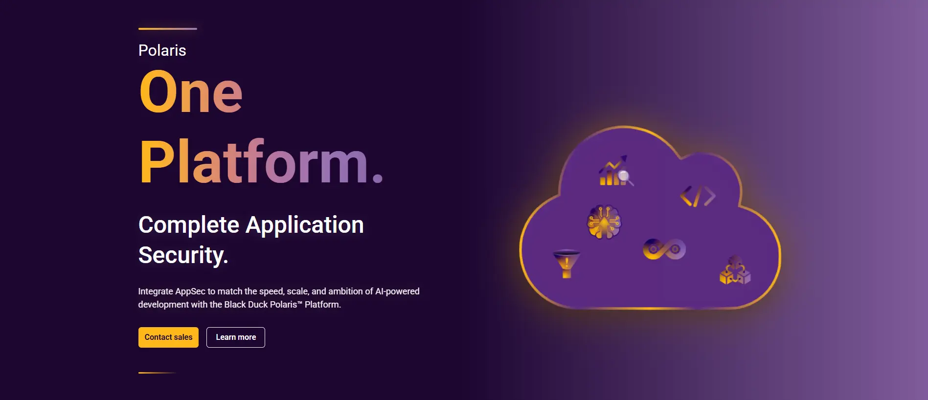
| Field | Field Type | Required? | Helper Text | Notes |
|---|---|---|---|---|
Banner Configuration |
||||
| Hero Variant | button_group | Not Required | Select which banner layout to display. |
|
| Eyebrow Text | text | Not Required | Small text above the heading | |
| Heading | text | Not Required | Main headline for the hero section. | |
| Heading Type | button_group | Not Required | Select the HTML heading tag for accessibility. |
|
| Sub Heading | text | Not Required | Second heading level (Variant 1 only). | |
| Description | textarea | Not Required | Supporting text displayed under the main heading. | |
| Banner Animation Type | button_group | Not Required | Select banner animation type |
|
| Floating Elements | repeater | Not Required | Add floating icons to the background (Variant 1 only). | |
| — Icon | image | Not Required | Upload or select an icon image. | |
| Embed HTML | textarea | Not Required | Paste the HTML markup for the right-side banner embed. | |
| Embed CSS | textarea | Not Required | Add any custom CSS styles for the embed. Do not include <style> tags. | |
| Embed JavaScript | textarea | Not Required | Add any custom JavaScript for the embed. Do not include <script> tags. | |
| Background Image | image | Not Required | Full-width background image (Variant 2 only). | |
| Feature Card | repeater | Not Required | Add one or more floating cards (Variant 2 only). | |
| — Page Selection | post_object | Not Required | Select a page or post to pull data from automatically (Title, Featured Image, and Link). | |
| — Page Link | link | Not Required | Overrides the selected page’s permalink. | |
| — Card Image | image | Not Required | Overrides the selected page’s featured image. | |
| — Card Title | text | Not Required | Overrides the selected page’s title. | |
| — Subtitle | text | Not Required | Overrides the selected page’s description/excerpt. | |
Horizontal Divider Block
View Preview
| Field | Field Type | Required? | Helper Text | Notes |
|---|---|---|---|---|
| Divider Position | button_group | Not Required | Select which side of the column the divider should appear on. |
|
| Divider Color | button_group | Not Required | Select which side of the column the divider should appear on. |
|
Image/Media Text
View Preview
| Field | Field Type | Required? | Helper Text | Notes |
|---|---|---|---|---|
Block Header |
||||
| Block Title | text | Not Required | Main title displayed above the content row. | |
| Block Heading Type | button_group | Not Required | Select the HTML heading tag for accessibility. |
|
| Block Heading Size | button_group | Not Required | Select the HTML heading tag size for accessibility. |
|
| Block Heading Color | button_group | Not Required | Choose the text color for the block title. |
|
| Block Description | wysiwyg | Not Required | Optional description text displayed under the block title. | |
Media Configuration |
||||
| Media Layout | select | Not Required | Choose the layout ratio for the media and content. |
|
| Reverse Row? | true_false | Not Required | If checked, the image will be on the right and text on the left. | |
| Select Media Type | select | Not Required | Select whether to display an image or a video. |
|
| Animation Type | select | Not Required | Choose an animation for when the block scrolls into view. |
|
| Enable Image Shadow | true_false | Not Required | Enable shadow effect on the media/image. | |
| Image | image | Required | Upload or select an image for the media section. | |
| Font Awesome Icon | font-awesome | Not Required | Upload or select an image for the media section. | |
| Icon | image | Not Required | Upload or select an SVG icon for the media section. | |
| Video Player Mode | button_group | Not Required | Choose if the video plays inline or in a popup modal. |
|
| Video Provider | button_group | Not Required | Select the video hosting platform. |
|
| Video Language | button_group | Not Required | Select the specific Brightcove player ID based on language. |
|
| Video ID/URL | text | Not Required | Enter the Video ID (for Brightcove/YouTube) or full URL. | |
| Video Placeholder | image | Not Required | Thumbnail image displayed before the video plays. | |
| Overlay Eyebrow | text | Not Required | Eyebrow text to display over the media element. | |
| Overlay Percentage | text | Not Required | e.g., 65% | |
| Overlay Description | textarea | Not Required | Text to display over the media element. | |
| Title | text | Not Required | Title for the content section. | |
| Card Heading Type | select | Not Required | Select the HTML heading tag for accessibility. |
|
| Card Heading Size | select | Not Required | Select the HTML heading tag for accessibility. |
|
| List Style | radio | Not Required | Choose the bullet point style for lists within the description. |
|
| Description | wysiwyg | Required | Main body text for the content section. | |
| Action Button | link | Not Required | The primary call-to-action link. | |
| Button Style | button_group | Not Required | Choose the visual style for the button. |
|
| Action Button Second | link | Not Required | The primary call-to-action link. | |
| Button Style Second | button_group | Not Required | Choose the visual style for the button. |
|
Image/Video Modal
View Preview
| Field | Field Type | Required? | Helper Text | Notes |
|---|---|---|---|---|
| Width Variant | button_group | Not Required | Choose between full-width or container-width display. |
|
| Select Media Type | button_group | Not Required | Select whether to display a static image or a video modal. |
|
| Video Provider | button_group | Not Required | Select the hosting platform for the video. |
|
| Video Player Mode | button_group | Not Required | Choose if the video plays inline or in a popup modal. |
|
| Image | image | Required | Upload or select an image to display. | |
| Video ID/URL | text | Required | Enter the ID or URL of the video (YouTube/Brightcove). | |
| Video Placeholder | image | Required | Image to display as the trigger for the video modal. | |
| Video Language | button_group | Not Required | Select the language for the Brightcove video player. |
|
Block: InnerBlocks Container
Integration Tabs Grid
View Preview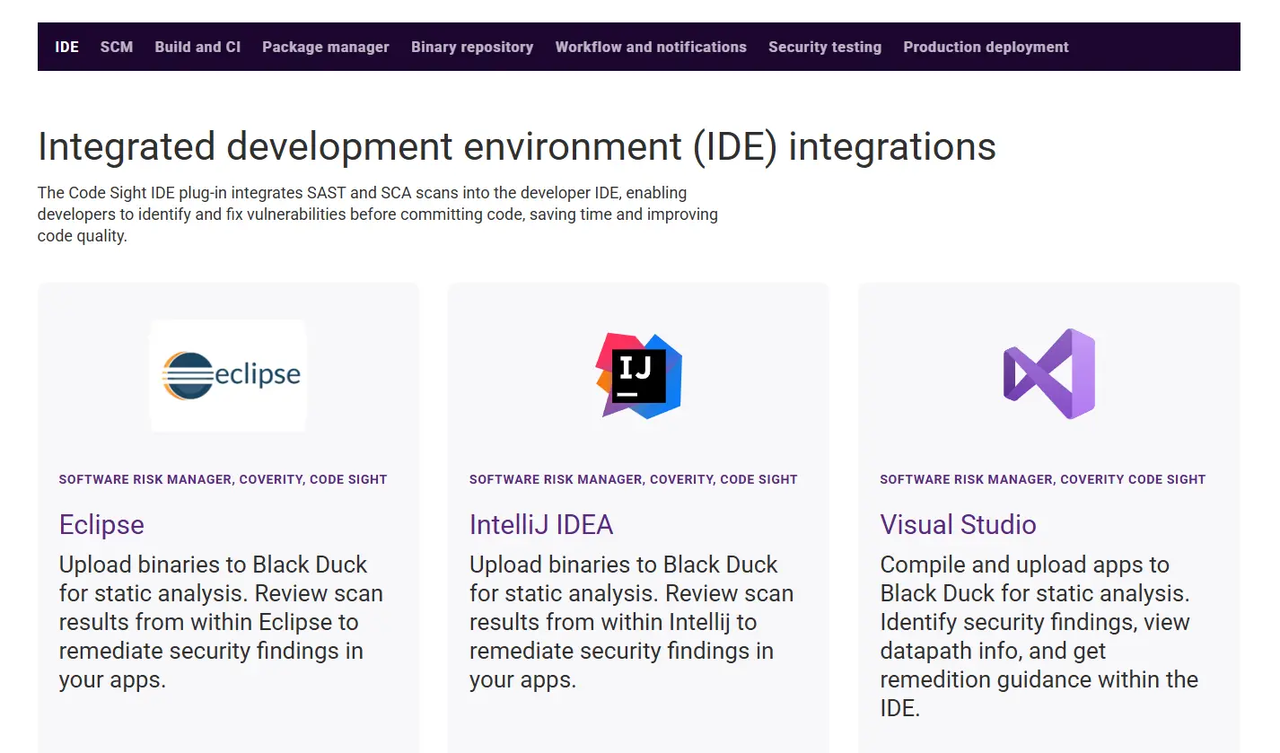
| Field | Field Type | Required? | Helper Text | Notes |
|---|---|---|---|---|
Integration Tab Content |
||||
| Tabs | repeater | Required | Add and manage individual integration tabs. | |
| — Tabs Nav Title | text | Required | Used for desktop tab navigation label. | |
| — Tabs Nav ID | text | Not Required | Used as anchor/unique identifier. Leave blank to auto-generate. | |
| — Tabs Heading | text | Required | Main heading displayed inside tab content. | |
| — Tabs Description | wysiwyg | Not Required | Description content shown below heading. | |
| — Cards | repeater | Not Required | Add and manage cards displayed within this tab. | |
| — — Card Image | image | Required | Icon or image displayed on the card. | |
| — — Card Eyebrow | text | Not Required | Small text displayed above the card heading. | |
| — — Card Heading | text | Required | Main headline for the card. | |
| — — Card Subtext | textarea | Not Required | Supporting description for the card. | |
| — — Card Link | link | Not Required | Allows the entire card or CTA area to link. | |
Layout Settings
| Field | Field Type | Required? | Helper Text | Notes |
|---|---|---|---|---|
Layout Settings |
||||
| Background Color | select | Not Required | Select the background theme for the block. |
|
| Top Spacing | select | Not Required | Select the amount of padding at the top of the block. |
|
| Bottom Spacing | select | Not Required | Select the amount of padding at the bottom of the block. |
|
| Grid Horizontal Gap | select | Not Required | Select the horizontal spacing between grid columns. |
|
| Background Image | select | Not Required | Select the background image for the block. |
|
| Background Image Upload | image | Not Required | Select the background image for the block. | |
Block: Leadership
View Preview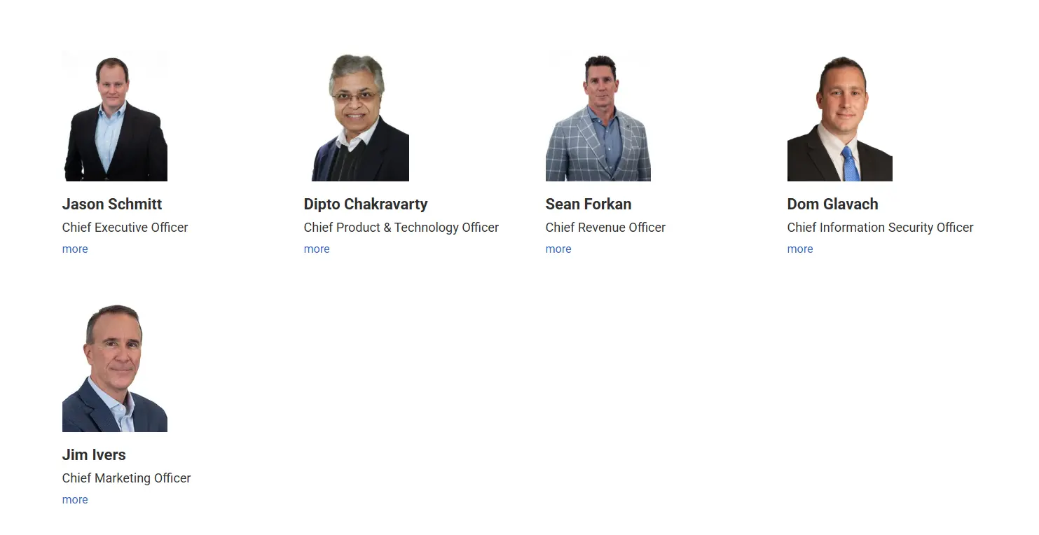
| Field | Field Type | Required? | Helper Text | Notes |
|---|---|---|---|---|
Leadership Detail |
||||
| Leadership Items | repeater | Not Required | Add and manage individual leadership profiles. | |
| — Profile Picture | image | Not Required | Upload a professional profile picture. | |
| — Name | text | Not Required | Full name of the leader. | |
| — Designation | text | Not Required | Job title or designation. | |
| — About Bio | wysiwyg | Not Required | A brief biography of the leader. | |
| — LinkedIn Link | url | Not Required | URL to the leader’s LinkedIn profile. | |
| — Facebook Link | url | Not Required | URL to the leader’s Facebook profile. | |
Block: Logo Reel
View Preview
| Field | Field Type | Required? | Helper Text | Notes |
|---|---|---|---|---|
Block Header |
||||
| Block Title | text | Not Required | Main title displayed above the logos. | |
| Block Heading Type | select | Not Required | Select the HTML heading tag for accessibility. |
|
| Block Heading Size | select | Not Required | Select the HTML heading tag for accessibility. |
|
| Block Heading Color | select | Not Required | Choose the text color for the block title. |
|
| Block Description | wysiwyg | Not Required | Optional description text displayed under the block title. | |
| Action Button | link | Not Required | The primary call-to-action link. | |
| Action Button Style | button_group | Not Required | Choose the visual style for the button. |
|
Block Logos |
||||
| Logos | repeater | Not Required | Add logos to the carousel. | |
| — Logo | image | Required | Upload or select a logo image. | |
Slider Settings |
||||
| Slider Settings | checkbox | Not Required | Select one or more slider behavior options. |
|
Media Text CTA
View Preview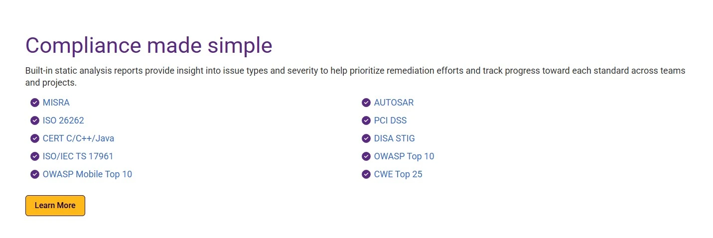
| Field | Field Type | Required? | Helper Text | Notes |
|---|---|---|---|---|
Media Content |
||||
| Layout | button_group | Not Required | Select the width distribution for the media and text columns. |
|
| Title | textarea | Not Required | Main headline for the block. | |
| Heading Type | button_group | Not Required | Select the HTML heading tag for accessibility. |
|
| Heading Size | button_group | Not Required | Visual size of the heading. |
|
| Block Heading Color | button_group | Not Required | Choose the text color for the heading. |
|
| List Style | radio | Not Required | Select the style for bullet points in the description. |
|
| Description | wysiwyg | Not Required | Supporting description text for the block. | |
| Action Button | link | Not Required | Optional call-to-action button. | |
| Button Position | button_group | Not Required | Alignment of the action button. |
|
| Button Style | button_group | Not Required | Visual style for the action button. |
|
Newsroom List
| Field | Field Type | Required? | Helper Text | Notes |
|---|---|---|---|---|
Newsroom Settings |
||||
| Pull Type | button_group | Not Required | Choose whether to show the latest newsroom articles or select them manually. |
|
| Number of Articles to Show | number | Not Required | Total number of articles to show (enter -1 for all). | |
| Show Excerpt | true_false | Not Required | Check to display the post excerpt below each article title. | |
| Select Newsroom Articles | relationship | Not Required | Select one or more newsroom articles manually. | |
Block Header |
||||
| Block Title | text | Not Required | Main title displayed at the top of the block. | |
| Block Description | textarea | Not Required | Introductory text displayed under the title. | |
| Heading Type | select | Not Required | HTML tag to use for the title (e.g. h2). |
|
| Block Heading Size | select | Not Required | CSS size class to use for the title (e.g. h2). |
|
| Heading Color | select | Not Required | Visual color style for the title. |
|
PDF Viewer
View Preview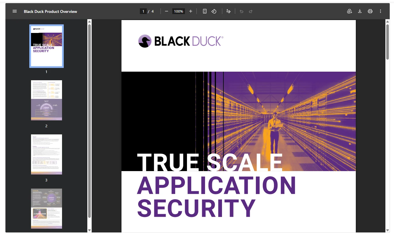
| Field | Field Type | Required? | Helper Text | Notes |
|---|---|---|---|---|
PDF Settings |
||||
| PDF File | file | Required | Upload the PDF file to display. | |
| Viewer Height (px) | number | Not Required | Set the height of the PDF viewer in pixels (e.g., 800). | |
Podcasts RSS Feed
| Field | Field Type | Required? | Helper Text | Notes |
|---|---|---|---|---|
Main Content |
||||
| Block Title | text | Required | Main title displayed at the top of the block. | |
| Block Heading Type | select | Not Required | Select the HTML heading tag for accessibility. |
|
| Block Heading Size | select | Not Required | Select the HTML heading tag size |
|
| Block Heading Color | select | Not Required | Choose the text color for the block title. |
|
| Description | wysiwyg | Not Required | Description text for the block. | |
Aside (Sidebar) |
||||
| Aside Title | text | Not Required | Title for the sidebar. | |
| Flag Type | select | Not Required | Select the flag type. |
|
| Flag Text | text | Required | Enter custom flag text. | |
| Flag Color | select | Not Required | Select the color of the flag. |
|
| Blog Category Picker | taxonomy | Not Required | Select a blog category for the RSS feed. | |
| Number of Feeds | number | Not Required | Number of feeds to display. | |
Pricing Plans
View Preview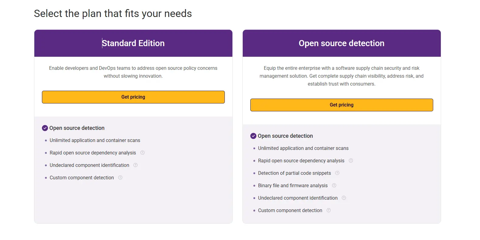
| Field | Field Type | Required? | Helper Text | Notes |
|---|---|---|---|---|
Block Header |
||||
| Block Title | text | Not Required | Main title displayed above the pricing plans. | |
| Block Heading Type | button_group | Not Required | Select the HTML heading tag for accessibility. |
|
| Block Heading Size | button_group | Not Required | Select the HTML heading tag for accessibility. |
|
| Block Heading Color | button_group | Not Required | Choose the text color for the block title. |
|
| Block Description | textarea | Not Required | Optional description text displayed under the block title. | |
Pricing Content |
||||
| Pricing Plans Variant | button_group | Not Required | Select the layout style for the pricing plans. |
|
| Pricing Items | repeater | Not Required | Add and manage individual pricing plans (Split Layout). | |
| — Plan Name | text | Required | The name of the pricing plan. | |
| — Plan Subheading | text | Not Required | Optional text displayed below the plan name. | |
| — Plan Description | textarea | Not Required | Summary of the pricing plan. | |
| — Price Prefix | text | Not Required | e.g. Available for | |
| — Price Value | text | Not Required | e.g. $500 or Included | |
| — Price Details | textarea | Not Required | e.g. per developer… | |
| — Plan Action | link | Not Required | Primary CTA button for the plan. | |
| — Show Trial Popup | true_false | Not Required | If enabled, a ‘Free Trial’ button will appear beside the Plan Action button. | |
| — Modal Header Title | text | Not Required | The small eyebrow title in the modal header. | |
| — Modal Title | text | Not Required | The main title displayed inside the trial popup modal. | |
| — Modal Subtitle | text | Not Required | Description text displayed below the modal title. | |
| — Trial Options | repeater | Not Required | Add multiple download or trial links to the modal. | |
| — — Option Link | link | Not Required | Link and text for the trial option button. | |
| — Plan Footer Text | text | Not Required | Text below the CTA button | |
| — Feature Groups | repeater | Not Required | Organize features into logical groups with titles. | |
| — — Group Title | text | Not Required | Optional title for this feature group. | |
| — — Show Group Icon | true_false | Not Required | Display a large check icon previous to group title | |
| — — Group Features | repeater | Not Required | List individual features for this group. | |
| — — — Feature Text | text | Required | The descriptive text for this feature. | |
| — — — Item Marker | select | Not Required | Select the icon to display next to the feature. |
|
| — — — Info Tooltip | text | Not Required | Optional tooltip text to display on hover (indicated by an ‘i’ icon). | |
| Pricing Items stacked | repeater | Not Required | This field will be use for stacked design | |
| — Plan Icon | file | Not Required | Optional icon image for the plan. | |
| — Plan Name | text | Required | The name of the pricing plan. | |
| — Plan Flag | text | Not Required | Optional badge text (e.g., ‘Most Popular’). | |
| — Plan Description | text | Not Required | Summary of the pricing plan. | |
| — Feature Groups | repeater | Not Required | Add rows of content for the stacked layout. | |
| — — Plans Content | wysiwyg | Required | The content displayed for this row. | |
| — Plan Action | link | Not Required | Primary CTA button for the plan. | |
| — Show Trial Popup | true_false | Not Required | If enabled, a ‘Free Trial’ button will appear beside the Plan Action button. | |
| — Modal Header Title | text | Not Required | The small eyebrow title in the modal header. | |
| — Modal Title | text | Not Required | The main title displayed inside the trial popup modal. | |
| — Modal Subtitle | text | Not Required | Description text displayed below the modal title. | |
| — Trial Options | repeater | Not Required | Add multiple download or trial links to the modal. | |
| — — Option Link | link | Not Required | Link and text for the trial option button. | |
Quote
View Preview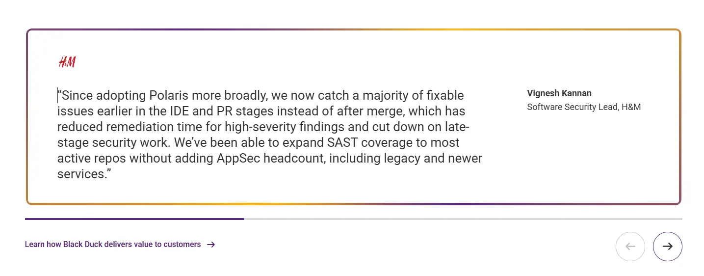
| Field | Field Type | Required? | Helper Text | Notes |
|---|---|---|---|---|
Block Header |
||||
| Block Title | text | Not Required | Main title displayed at the top of the block. | |
| Block Heading Type | select | Not Required | Select the HTML heading tag for accessibility. |
|
| Block Heading Size | select | Not Required | Select the HTML heading tag for accessibility. |
|
| Block Heading Color | select | Not Required | Choose the text color for the block title. |
|
Quotes |
||||
| Quotes | repeater | Required | Add one or more quotes. If more than one, they will display in a carousel. | |
| — Quote Logo | image | Not Required | Upload the company logo or headshot related to the quote. | |
| — Quote | textarea | Required | The main text of the quote. | |
| — Author Name | text | Required | The name of the person being quoted. | |
| — Author Title | text | Not Required | The job title or company of the author. | |
| — Author Link | link | Not Required | Optional link for the author’s name or title. | |
| View All Auote Action Link | link | Not Required | Optional link to a ‘View All Quotes’ page. | |
Rich Text Editor (RTE)
View Preview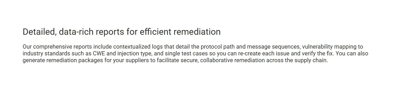
| Field | Field Type | Required? | Helper Text | Notes |
|---|---|---|---|---|
Block Header |
||||
| Block Title | text | Not Required | Main title displayed above the content row. | |
| Block Heading Type | button_group | Not Required | Select the HTML heading tag for accessibility. |
|
| Block Heading Size | button_group | Not Required | Select the HTML heading tag for accessibility. |
|
| Block Heading Color | button_group | Not Required | Choose the text color for the block title. |
|
| Block Description | wysiwyg | Not Required | Optional description text displayed under the block title. | |
Content |
||||
| Layout | button_group | Not Required | Select the width distribution for the media and text columns. |
|
| Content | wysiwyg | Required | Enter and format your content using the editor below. | |
| Right Content | wysiwyg | Required | Enter and format your content using the editor below. | |
Settings |
||||
| Max Width | select | Not Required | Select the maximum width for the content. |
|
| Alignment | button_group | Not Required | Choose the horizontal alignment for the content. |
|
| List Style | radio | Not Required | Choose the bullet point style for lists within the content. |
|
| Content Heading Color | select | Not Required | Select the color for headings inside the content. |
|
| Content Heading Custom Color | color_picker | Not Required | Select a custom color for headings inside the content. | |
| Content Description Color | select | Not Required | Select the color for paragraphs and text inside the content. |
|
| Content Description Custom Color | color_picker | Not Required | Select a custom color for paragraphs and text inside the content. | |
| Content Container BG Color | select | Not Required | Select the background color for the content container wrapper. |
|
| Content Container Custom BG Color | color_picker | Not Required | Select a custom background color for the content container wrapper. | |
Segment Info Block
View Preview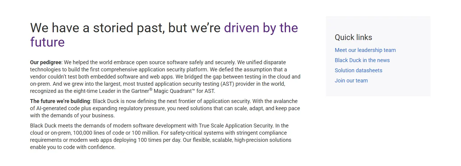
| Field | Field Type | Required? | Helper Text | Notes |
|---|---|---|---|---|
| Layout | button_group | Not Required | Select between a full-width centered layout or a split layout with sidebar. |
|
Segment Detail |
||||
| Description | wysiwyg | Required | The primary text content for the segment. | |
| List Style | radio | Not Required | Select the style for bullet points in the description. |
|
| CTA Button | link | Not Required | Optional call-to-action button displayed below the description. | |
| CTA Style | button_group | Not Required | Select the visual style for the CTA button. |
|
| CTA Arrow | button_group | Not Required | Select the arrow direction for the CTA button. |
|
| CTA Button 2 | link | Not Required | Optional second call-to-action button displayed beside the first. | |
| CTA Style 2 | button_group | Not Required | Select the visual style for the second CTA button. |
|
| CTA Arrow 2 | button_group | Not Required | Select the arrow direction for the second CTA button. |
|
Segment Quick Links |
||||
| Side Title | text | Not Required | Headline for the sidebar section. | |
| Side Background Color | button_group | Not Required | Choose the background theme for the sidebar. |
|
| Side Content | wysiwyg | Not Required | Supporting text or links for the sidebar area. | |
| Side Content Other box | wysiwyg | Not Required | Supporting text or links for the sidebar area. | |
SIG Marketo Form Block
View Preview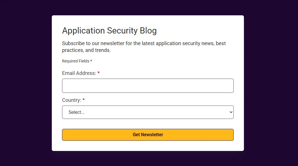
| Field | Field Type | Required? | Helper Text | Notes |
|---|---|---|---|---|
Form Details |
||||
| Form Variant | select | Not Required | Select the display layout for this form component. |
|
| Thank You page | link | Not Required | Select the page to redirect to after successful form submission. | |
| Popup Form ID | text | Required | Enter the ID for the popup form (e.g. download_report). | |
| Left Content | wysiwyg | Required | Enter descriptive/supporting text shown on the left side (only for Split layout). | |
| Form Heading | text | Required | Main title displayed above the form. | |
| Form Heading Type | select | Not Required | Select the HTML heading tag for accessibility. |
|
| Form Heading Size | select | Not Required | Select the visual size of the heading. |
|
| Form Heading Color | select | Not Required | Choose the text color for the form heading. |
|
| Form Description | wysiwyg | Not Required | Supporting description text for the form. | |
Marketo Configuration |
||||
| Marketo Program Selector | select | Required | Select the Marketo program this form belongs to. |
|
| Advanced Selection | true_false | Not Required | Enable to manually enter a Marketo Form ID. | |
| Marketo Form ID | number | Not Required | Enter the numeric Marketo Form ID (e.g. 1234). | |
Hidden Fields |
||||
| Auto Responder ID | text | Required | Hidden field: Auto Responder ID appended to the Marketo form submission. | |
| Alert Email | text | Required | Hidden field: Email address to receive alert notifications on form submission. | |
| Lead Source Most Recent | text | Required | Hidden field: Lead Source Most Recent value appended to the form. | |
| Last Campaign ID | text | Required | Hidden field: The ID of the last Marketo campaign associated with this form. | |
| Last Campaign Name | text | Required | Hidden field: The name of the last Marketo campaign associated with this form. | |
Block: Spotlight
View Preview| Field | Field Type | Required? | Helper Text | Notes |
|---|---|---|---|---|
Spotlight Configuration |
||||
| Spotlight Title (Eyebrow) | text | Not Required | Small text at the top, usually ‘Report’ or similar. | |
| Spotlight Media Type | button_group | Not Required | Small text at the top, usually ‘Report’ or similar. |
|
| Image | image | Not Required | Upload or select an image for the spotlight. | |
| Video | file | Not Required | Upload or select a video file for the spotlight. | |
| Image on Right? | true_false | Not Required | Toggle to display the image/video on the right side on desktop. | |
| Description | wysiwyg | Not Required | Enter the main description text for the spotlight. | |
| Spotlight Content List | wysiwyg | Not Required | Additional list or supporting content for the spotlight. | |
Table Of Content
View Preview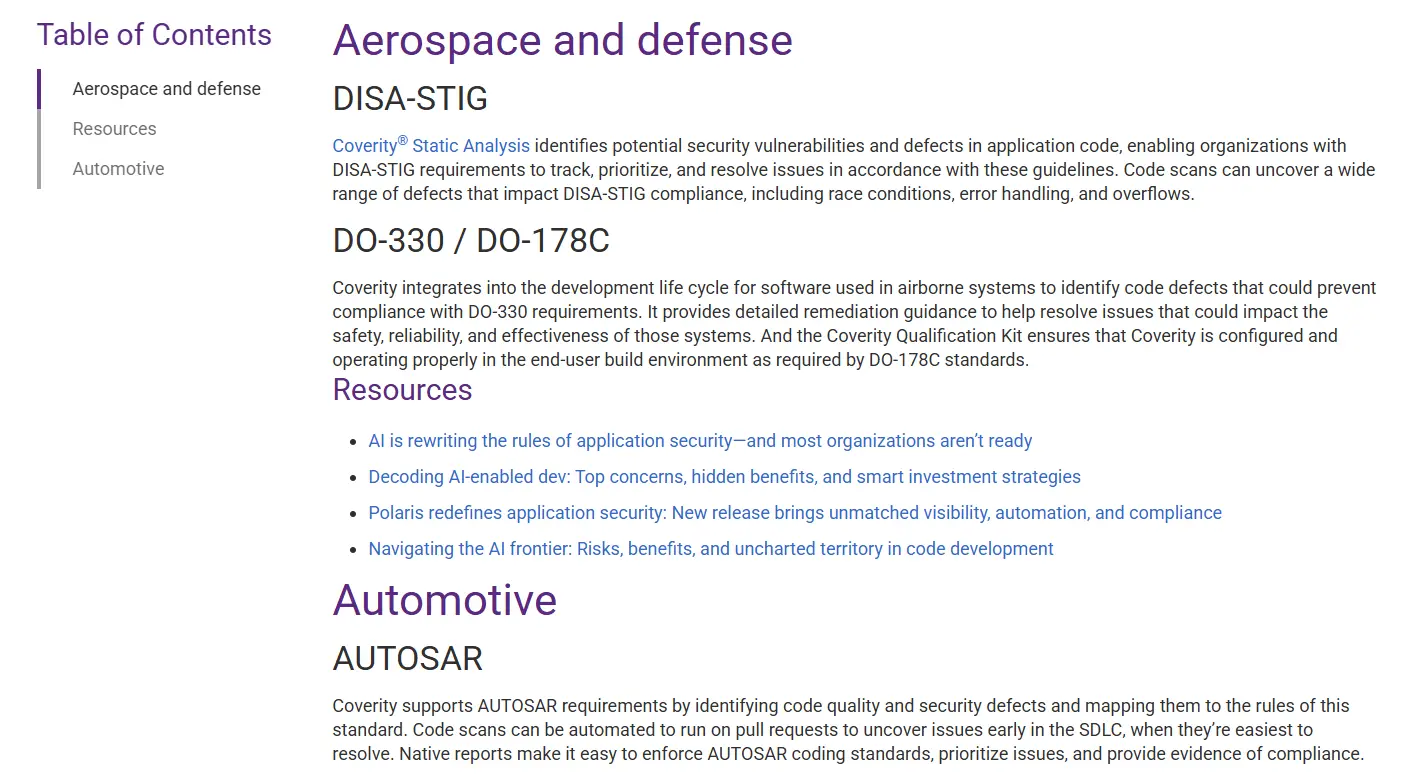
| Field | Field Type | Required? | Helper Text | Notes |
|---|---|---|---|---|
Content |
||||
| Content | wysiwyg | Not Required | Enter the title or introductory text for the Table of Contents. | |
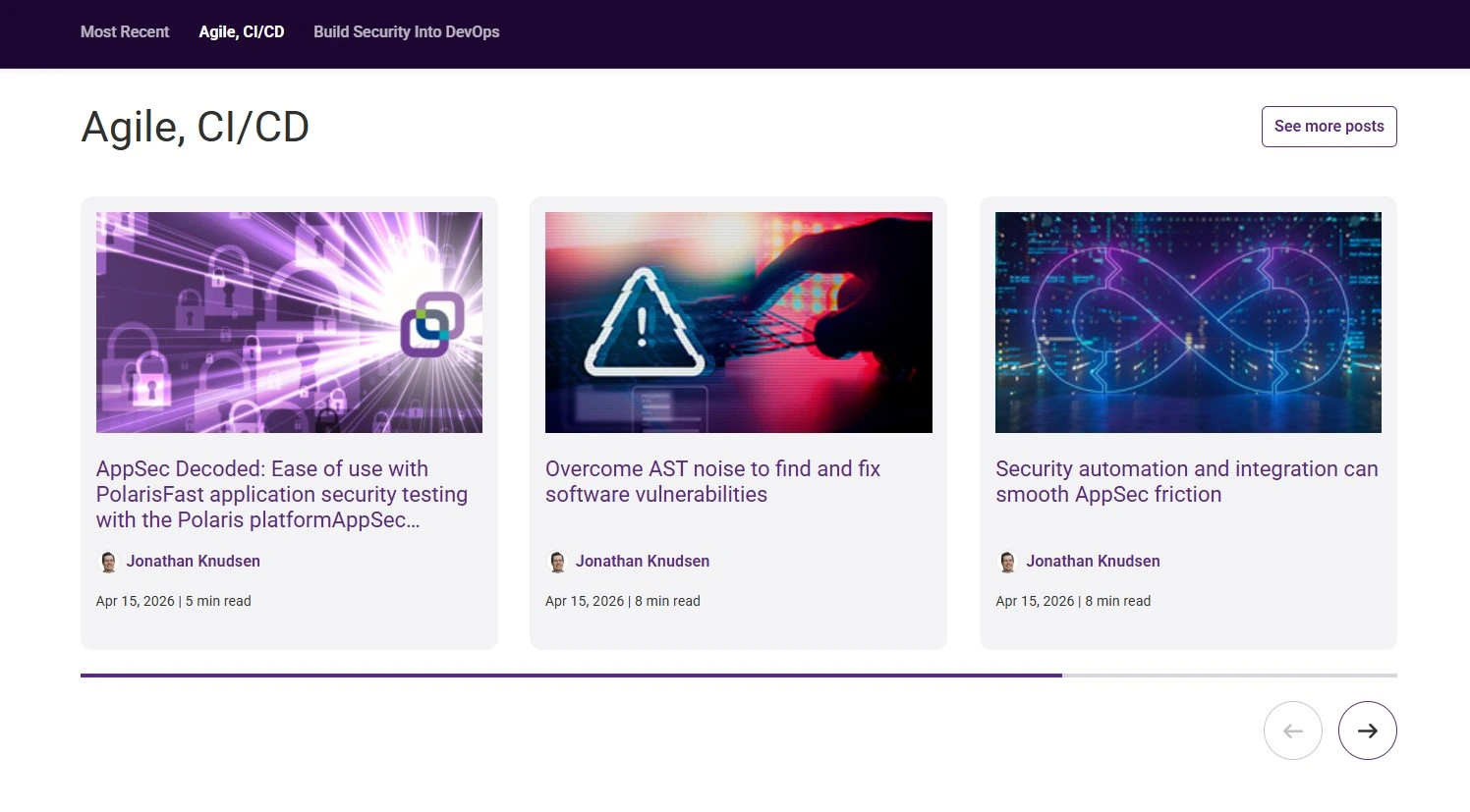
Workflow Steps
View Preview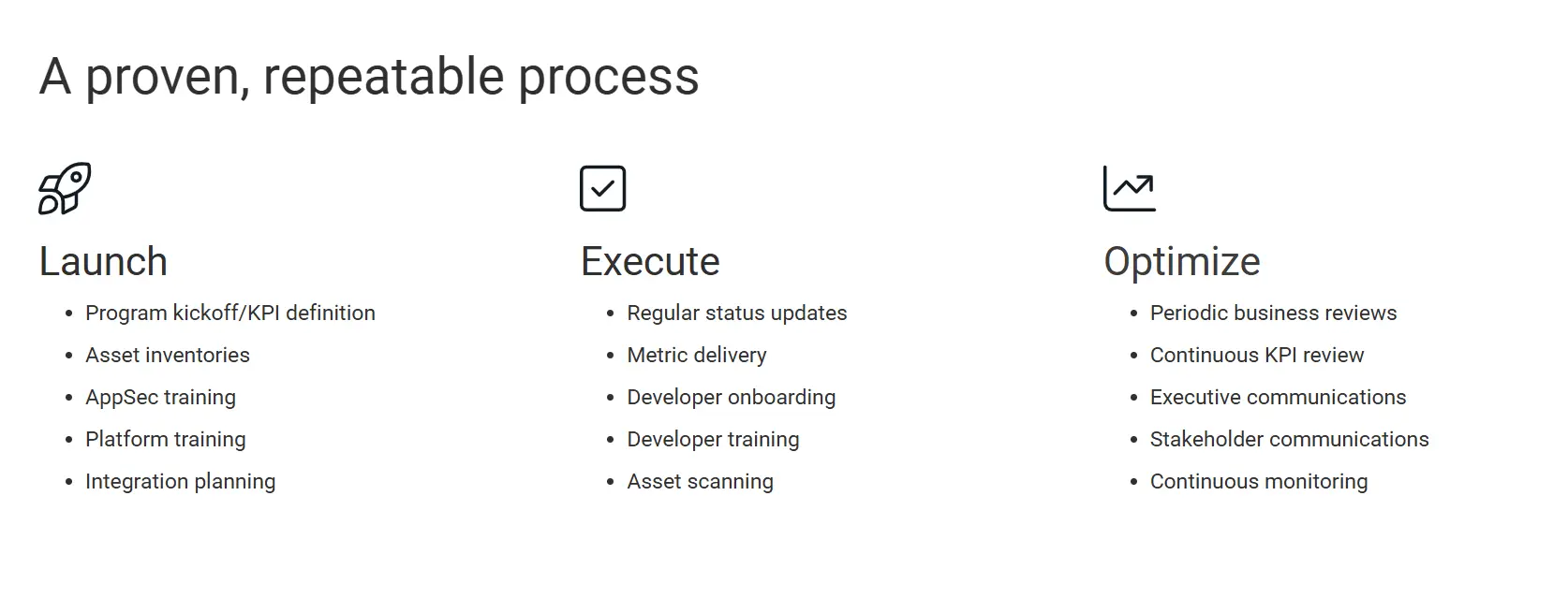
| Field | Field Type | Required? | Helper Text | Notes |
|---|---|---|---|---|
Block Header |
||||
| Block Title | text | Not Required | Optional title for the block. | |
| Block Heading Type | select | Not Required | Select the HTML heading tag for accessibility. |
|
| Block Heading Size | select | Not Required | Select the visual size of the heading. |
|
| Block Heading Color | select | Not Required | Choose the text color for the block title. |
|
Steps Content |
||||
| Grid Columns | select | Not Required | Select the number of columns for the workflow steps grid. |
|
| Workflow Steps | repeater | Not Required | Add and manage individual workflow steps. | |
| — Icon Type | button_group | Not Required |
|
|
| — Icon Image | image | Required | ||
| — Icon (Font Awesome) | font-awesome | Required | ||
| — Title | text | Required | ||
| — Workflow Steps Title Type | select | Not Required |
|
|
| — Workflow Steps Title Size | select | Not Required |
|
|
| — Description | wysiwyg | Not Required | ||
| — Link | link | Not Required | ||